

Colour can make or break a logo. Get it right and you'll create something memorable that reinforces the brand story. Get it wrong and even a strong concept falls flat.
But here's what many logo designers get wrong – they add colour too early in the process.
This guide will show you when to introduce colour, why it matters strategically, and how to develop colour palettes that actually work. We'll cover the technical side (accessibility, saturation, colour modes) and the creative side (finding your style, building your skills, knowing when to break the rules).
When to Add Colour to Your Logo Concepts
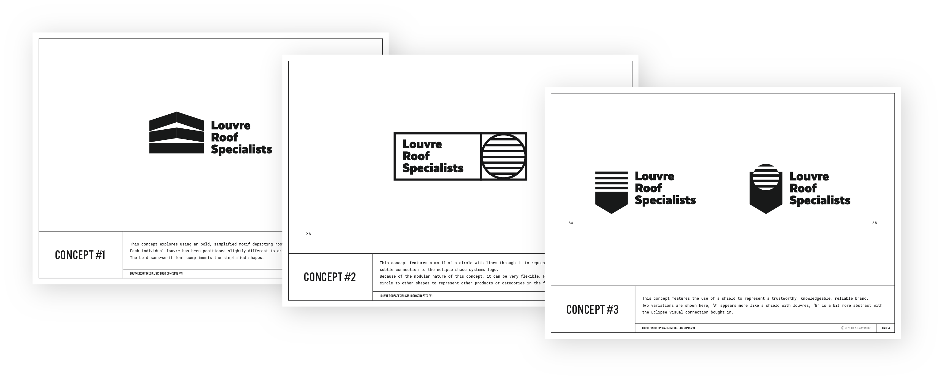
As a new logo designer, you might want to jump straight into adding colour to your concepts. Don't.
Wait until you have a clear concept that your client is happy to develop further. Colour affects psychology and influences decisions. If you show coloured concepts too early, clients will choose based on how it's been coloured rather than the strength of the underlying form and idea.
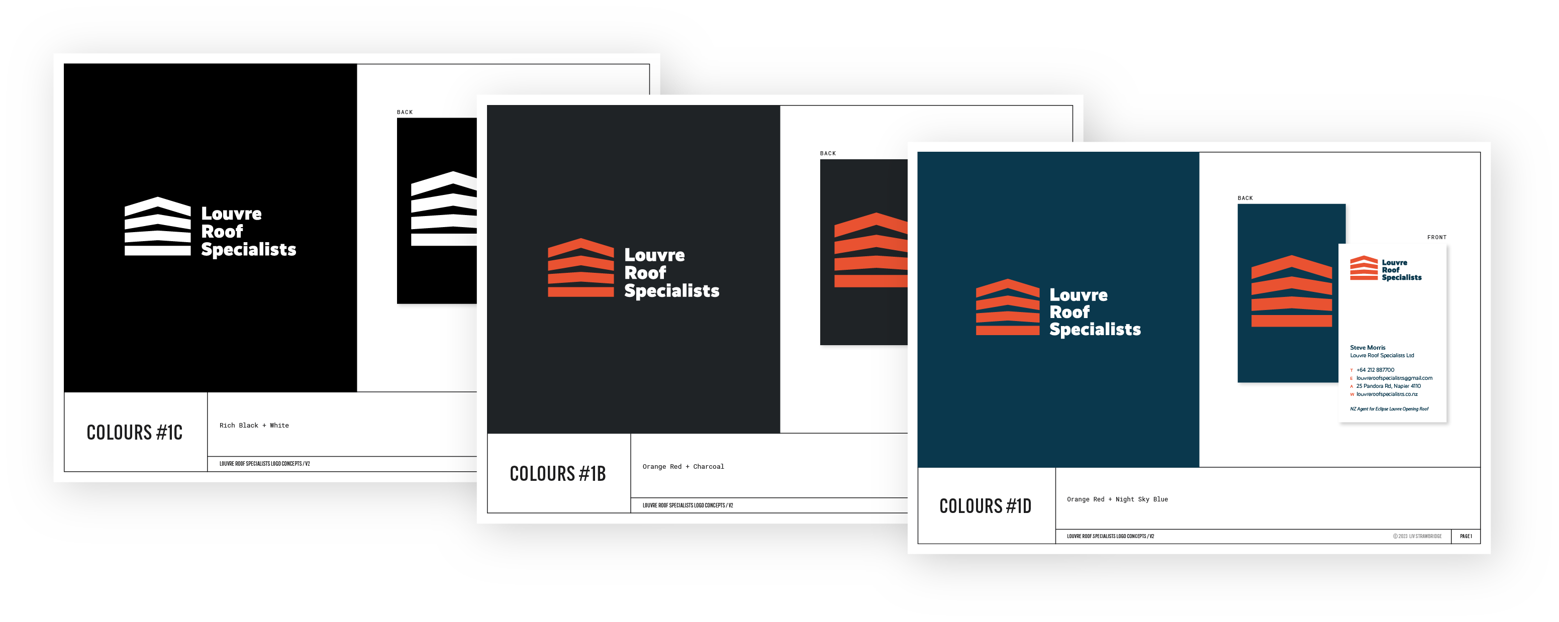
Instead, go from sketches to digitised concepts in black and white, and then once you and your client have chosen a concept to develop, explore colour options together.
This approach gives you three advantages:
- You save time. No point spending hours colouring concepts you won't use.
- You reduce bias. Concepts get chosen based on form, structure, and meaning rather than someone's favourite colour.
- You ensure it works in mono. One-colour versions are essential for applications like embroidery, stamping, or situations where full colour isn't possible. If your logo only works in colour, you don't have a strong logo.
So to sum up: don't add colour at the start. Only add it once you have a client-approved concept and you're in the development stage.
Why Colour Matters in Logo Design
Now that you know when to add colour, let's talk about why it's worth the strategic thought.
Colour supports the brand story
Different colours evoke different emotions, so choosing colours that support the brand story helps to build trust and credibility. Think about how particular industries tend to use certain colours – there's a reason financial brands often use blue (trustworthy, stable) while eco brands lean towards green (natural, growing).
But sometimes the most interesting brands break these patterns intentionally. I noticed recently that both Simplicity and Squirrel – two finance brands – use orange in their branding. Orange has an uninhibited, adventurous, optimistic quality. Both these brands are doing finance a bit differently than traditional companies, and their colour choice signals that.
The colours you choose should work in the background to reinforce what the brand is already saying through its name, messaging, and visual style.
Colour creates differentiation
When you're designing a logo, you should be doing at least a basic competitor analysis to see what colours dominate in that industry or category. Then choose colours that help your client's brand stand out and be memorable from the rest.
If every competitor is using blue, there might be an opportunity in warm colours. If everyone's gone minimalist with black and white, perhaps there's space for a carefully chosen accent colour. The goal isn't to be different just for the sake of it – it's to make sure the brand doesn't blend into the background.
Create Strong Colour Palettes
Here are some practical, technical considerations that will help to give you professional results.
Start in CMYK
Always create your colour palettes in CMYK. This might seem counterintuitive since most of the brand's applications will probably be digital (RGB), but CMYK is the more restrictive colour space. If you design in CMYK first, you'll know the colours can be printed. Converting from CMYK to RGB later is straightforward, but going the other way often leads to disappointing results when colours can't be accurately reproduced in print.

RGB (used for screens) can display colours that don't exist in CMYK (used for printing). Bright, vibrant colours that look amazing on screen often shift and dull when converted to print. If you design in RGB first and then need to convert to CMYK for business cards or signage, you might find your carefully chosen palette looks completely different.
Starting in CMYK means you're working within print limitations from the beginning. When you convert those colours to RGB for digital use, they'll only get brighter and more vibrant – a pleasant surprise rather than a disappointing shift.
👉 If you want to understand the technical differences between these colour spaces, this video explains RGB vs CMYK really clearly. And for more on converting colour modes when delivering your final files, see my guide on delivering final logo packages.
Match your saturation
Saturation is the intensity or brightness of a colour. When you're building a multi-colour palette, make sure the saturation levels feel cohesive. If one colour is bright and punchy while another is muted and dusty, they'll most likely feel like they belong to different brands.
👉 A simple test: put your colours next to each other and squint. Do they feel like they have similar energy levels? If one jumps out while the others recede, you might need to make some adjustments.
Check for accessibility
Not everyone's eyes see the same way. You need to think about how different people will perceive your colour choices and ensure there's enough contrast for legibility.
This is especially important for any text or interface elements, but it matters for logos too. If your logo has light text on a coloured background, or uses two colours next to each other, you need to make sure there's sufficient contrast.
The baseline minimum contrast ratio is 4.5:1 for normal-sized text and important design elements. This is the WCAG AA standard (Web Content Accessibility Guidelines Level AA), which is what most designers aim for. For larger text or elements (18pt+ regular, or 14pt+ bold), you can get away with 3:1. For enhanced accessibility (WCAG AAA), aim for 7:1 or higher.
While logos as images don't strictly need to meet these ratios, if your logo contains text or will be used in UI contexts (buttons, headers, navigation), aiming for at least 4.5:1 ensures the logo works well across all applications.
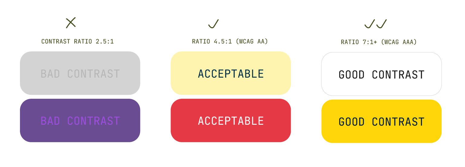
Use a tool like Colour Contrast Checker to verify your combinations meet accessibility standards. I've seen beautiful designs lately with contrast so bad I can barely read them. If I'm struggling, someone with a visual impairment or colour blindness doesn't stand a chance. Getting this right from the start means your work actually works – everywhere.
👉 If you want to understand more about how contrast ratios are calculated and why these numbers matter, WebAIM's guide to evaluating contrast explains the technical details clearly.
Avoid pure black and white
I've created brands for several clients over the years who wanted to use a black and white palette because they wanted to convey elegance, minimalism, timelessness, or sophistication. Black and white can absolutely do all those things.
But here's a tip: avoid using pure black or pure white. Instead, use a warm or cool black (add a tiny bit of magenta for warmth, or cyan for coolness) and an off-white (small amounts of cyan, magenta, and yellow create a softer white).
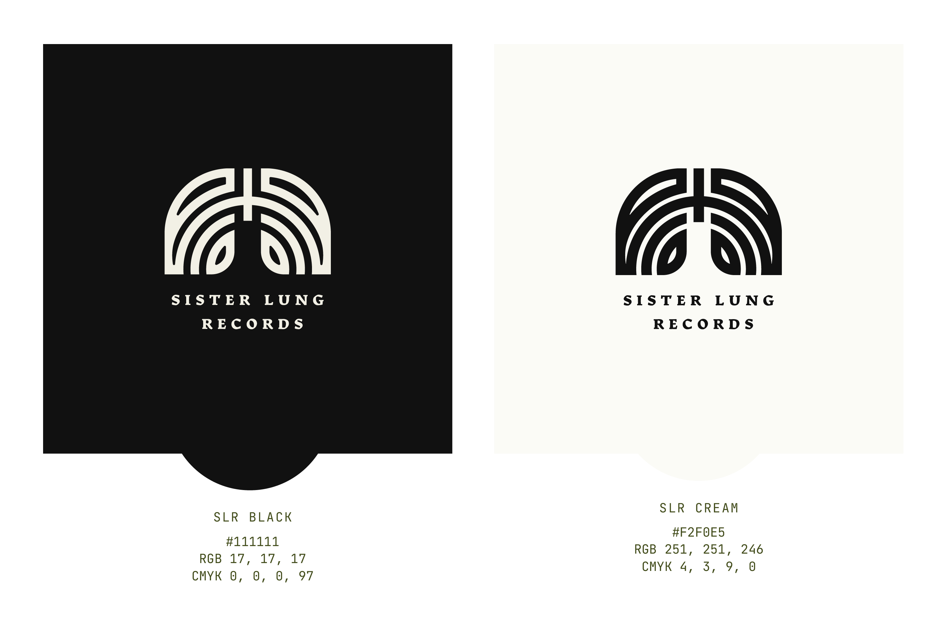
This approach adds subtle sophistication and softens the contrast, making the overall effect less jarring. The difference is small but noticeable.
Develop Colour Skills Over Time
Creating good colour palettes is a skill that improves with practice. Here's how to develop your eye and build your confidence with colour.
Your skills will improve with practice
Like anything in design, your colour sense will develop over time. When I was a junior designer, I had a colleague who created incredible colour combinations in their designs. It genuinely inspired me. One day they mentioned they were colourblind, which completely surprised me – their colour work was the best I'd seen.
Turns out they worked extra hard at colour specifically because they knew it was something they needed to pay attention to. They'd developed systems, saved references, and practiced deliberately. They proved that colour skills can be learned and refined, even if you don't start with a natural advantage.
Build a colour inspiration system
Keep an eye out for colour palettes that work well and save them all in one place. This could be a folder on your computer, a Pinterest board, a Notion database, or even a physical notebook where you collect screenshots and notes.
When you find a combination you love, save it with a note about why it works. Is it the saturation match? The unexpected pairing? The way it supports a particular mood? Building this reference library means you'll always have inspiration when you're stuck.
👉 Check out Pigment and Vibe Palette – tools to help you explore colour combinations and see what works well together.
Give yourself creative constraints
Colour palettes can feel overwhelming, and having too many options can lead to weaker results. Try giving yourself restrictions:
- Limit yourself to two colours maximum (one main colour, one accent)
- Use only one colour with tints and shades (monochromatic approach)
- Choose colours from a single section of the colour wheel (analogous harmony)
- Work with one vibrant colour and neutral greys
- Pick colours based on a photograph you love
Constraints force you to be more creative within boundaries, and often lead to more cohesive results.
Learn colour psychology, then decide when to use it
Understanding what different colours typically communicate is useful knowledge. Blue suggests trust and calm. Red implies energy and urgency. Green connects to nature and growth. Orange feels friendly and approachable.
These associations aren't rules, they're tendencies. The most memorable brands sometimes ignore these conventions entirely. A bright, bold palette for a law firm. Soft pastels for a tech startup. Black and neon for a wellness brand.
Learn what colours typically evoke, then make deliberate choices about when to follow those patterns and when to break them. The key is that it should always be intentional, supporting the specific story this particular brand is trying to tell.
Develop your style (but experiment first)
Over time you'll likely discover what colour combinations feel right to you. Personally, I prefer working with minimal colour palettes – if I can use just two colours, I will. Usually one main colour and a complementary tint or shade.
Other designers have become well-known for their individual approaches, for example – Leta Sobierajski creates quirky, highly colourful work that blends various mediums, and April Greiman pioneered the use of bright, clashing block colours in digital design. Both have strong, recognisable colour styles.
You can become known for your particular approach to colour, and clients will come to you specifically for that. But don't force a style too early. Experiment widely first, then notice what patterns emerge naturally in your work.
Learn the rules, then learn when to break them
Remember to experiment with your colour choices. Sometimes the most memorable combinations are the most unexpected. A deep burgundy for a tech brand. Bright yellow for a luxury product.
Your goal is to use colours that enhance the brand's message, not confuse it. But that doesn't mean you have to follow every convention. Learn the standard approaches, understand why they exist, then make informed decisions about when breaking them will create something stronger.
Final Thoughts
Getting good at colour takes time and practice, but it's one of the skills that can genuinely elevate your logo design work. The key insights to remember:
- Add colour later in your process, after the concept is approved. This keeps the focus on the strength of the idea rather than colour preference, and ensures you're not wasting time colouring concepts you won't use.
- When you do add colour, think strategically about how it supports the brand story and differentiates from competitors. Then apply the technical knowledge; work in CMYK, check accessibility, and match saturation.
- Your colour skills will develop with practice. Build a reference library, give yourself constraints, and pay attention to what combinations feel right to you. Over time, you'll develop confidence and possibly even a recognisable style.
Most importantly, trust the process. Colour might feel overwhelming now, but every palette you create makes the next one easier.